It irks me when type is not kerned well – even on takeout menus. I play in the sans and revel in the serif, particularly the block kind. I typeset my grocery lists. Don’t judge me, please. I will convert you if you dare harken my words.
There are typefaces that I rely on, for both website design and traditional graphic design. Well-crafted faces with sophisticated kerning pairs. Faces with elegant type hints at small and large sizes. Myriad. Minion. Museo Slab. I will freely admit how much I adore Helvetica Neue and will go to the mattresses if you disagree. There’s good reason that this typeface is still in use.
Typographic history
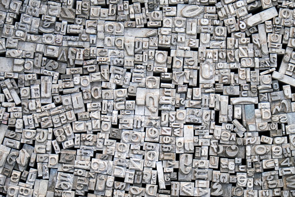
I hate to say it, but as a culture we’ve unfortunately lost some of our typographic history. When I hear the word leading, a word you likely know as linespacing, I experience the word through a tactile memory of holding lead spacers in my hand. My father had set up a little print shop in the extra bedroom of our home where I would hand-set stationery and cards as a kid. I grew up in suburban New York surrounded by California job cases full of type cast with an artistry decidedly different than today’s bits and bytes. I can still hear the sticky sound of ink rolling across the platter of our little letterpress.

When I taught Typographic History at RIT, I always got the same look when I explained why linespacing is called leading. Their heads tilted with varying degrees of squinting. They had no idea. My mission became to keep that knowledge alive. So don’t get me started on the difference between a font and typeface.
Ok, I can’t resist. Here’s the short version. A font is an instance of a typeface. Helvetica Neue is a typeface. Helvetica Neue 55 Roman at 9 points is a font. In short, don’t pay heed to any terminology ever used by Microsoft.
My typographic roots
I’m no stranger to the digital. I live in Photoshop and Illustrator every day. I rocked a Commodore PET and my Apple ][+ with dual disk drives before most people had remote-control color televisions in their living rooms. I went to computer camp and learned how to code my own games and productivity software. I played with fonts on the first Mac six months before it hit the market. Yeah, I’m that old.
The digital age has been fantastic for typography, don’t get me wrong. There are well-crafted new families suitable for professional work, and then there are ones metaphorically slapped together in people’s basements. Perfectly fine for making a sign for Johnny coming home from camp or the funny note on the breakroom fridge. I just wish more people knew the difference.
I am grounded in the Modernism of the Bauhaus, unfortunately now called mid-century modernism, but my mind still exploded in the nineties like everyone else with the exploration of what was possible with faces such as Matrix and Dead History from Emigre. If you want to travel in time to the typography revolution, check out Émigré No. 19: Starting from Zero from 1991.
Type in motion
My love of type came from my father, my typographic education beginning at the movies. Sure, we enjoyed car chases and explosions like other guys, but the best part was the opening title sequences. The projection’s glow silhouetted my dad’s long arms as he pointed out the serifs of one typeface over another. How the size, placement, and motion related to what the movie promised ahead. As I got older it became fun quizzes – yes, at the movies. We ignored the hushes. His passion for it became mine. I still refuse to watch a movie for the first time if I miss the opening titles. Drives my wife nuts.
My blood runs with ink. My dad’s first career was as a printer and graphic artist, and his father and uncle were printers, too. The Commanday Brothers opened shop around 1920 on Varick Street in Manhattan, nestled between Soho and The Village. There’s a WeWork and Dunkin Donuts there now, at least according to Google. I still smile at the way my father described his father: a man of few words who could carry fifty pounds of type in each hand across twenty New York City blocks. The Commanday Brothers were lucky to flourish during the Depression with government printing contracts, including printing the blueprints to the bazooka. At least according to my father. He was proud, so so was I.
Type in web design
I love being a typography geek. Every new project I work on holds the possibility for finding a new typeface to fall in love with. My most recent find was Varela Round. Yes, a Google font. We used it for our new navigation bar in our own corporate website redesign. It’s clean and easy to read. A monospaced face that has more of a wide appearance. Perfect.
If you love type like me, shout it to the rooftops. We need more typo geeks in the world.

